
openCRX Basic Customization
Version 1.7.0
www.opencrx.org
The contents of this file are subject to a BSD license (the "License"); you may not use this file except in compliance with the License.
You may obtain a copy of the License here
- List of Figures
- 2-1. openCRX UI rendering process
- 3-1. openCRX UI building blocks
- 4-1. Views customized by sample.xml
- 4-2. Effect of setting changeable to false
- 4-3. Effect of setting filterable to false
- 4-4. Effect of setting sortable to false
- 4-5. Multiple Grid Panes
- 4-6. Grid Customizing with maxMember and showMaxMember
- 4-7. Effect of setting inPlace to true
- 4-8. Grid in Edit Mode
- 6-1. The ui1 Model - Diagram Main
- 6-2. The ui1 Model - Diagram ElementDefinitions
- 6-3. The ui1 Model - Diagram Inspectors
- List of Examples
- 4-1. sample.xml
- 4-2. Inspector Definition
- 4-3. Inspector Tab Definition
- 4-4. FieldGroup Definition
- 4-5. Field Positioning
- 4-6. Column Break
- 4-7. Example with changeable
- 4-8. Example with filterable - Class Filter Button
- 4-9. Example with filterable - Attribute Filter Buttons
- 4-10. Example with sortable - Attribute Sort Buttons/Indicators
- 4-11. Grid Tab Definition
- 4-12. Field Ordering in the Grid
- 4-13. Grid Tab Definition with maxMember/showMaxMember
- 4-14. Example with inPlace - Editable Grid
- 5-1. UI Configuration Overloading - Hiding Tab [Invoices] with zHideElements.xml
Chapter 1. About this Book
openCRX is a professional Open Source CRM application. openCRX is based on the openMDX [02] application framework, an open source application framework based on the OMG's model driven architecture (MDA) standards. This guarantees maximum openness, standards compliance and a state-of-the-art component-based architecture.
Who this book is for
This book describes the basics of customizing the user interface (UI) of openCRX. The intended audience are openCRX system administrators.
What do you need to understand this book
This book describes the basics of customizing openCRX. The book assumes that you are somewhat familiar with XML. If you want to go into the details of customizing the UI of openCRX it is certainly helpful if you are familiar with UML as well so that you can "read" the ui1 model (see Chapter 5)
Chapter 2. Overview UI Rendering Process
The user interface (UI) of openCRX can be customized in many ways: you can change colors, fonts, the placement of fields, etc. This guide explains some basic customization features of the openCRX UI, in particular how to place individual fields (attributes in XML speak) on the screen or how to hide attributes you don't need.
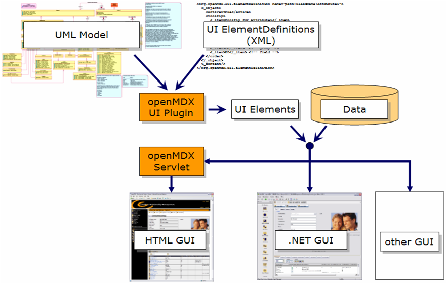
Before we dive into the details, however, it is probably helpful to gain a rough understanding of the UI rendering process (Figure 2-1 gives a schematic overview of the UI rendering process). At the core of each openMDX-based application is the UML model (or multiple models, for that matter). The UML Model is the place where classes, attributes, references, etc. are defined. The UI customizer prepares UI config files (XML files containing UI ElementDefinitions). Based on the UML Model and these UI ElementDefinitions the openMDX UI Plugin creates all the required UI Elements. It is important to note that these UI Elements are still platform-independent and GUI-neutral.
At the end of the rendering process you have a variety of possibilities to create the final GUI with relatively little effort. Included in the openCRX distribution is the openMDX Servlet combining data and the appropriate UI Elements to produce HTML pages which can be viewed with any new and standard-compliant browser (the openCRX FAQ contains a list of supported browsers). CRIXP Corp. developed an advanced .NET GUI for the Windows platform. Furthermore, it would be pretty straight-forward to develop your own GUI, e.g. based on Java or Laszlo, and it is absolutely no problem to access the openCRX server with a variety of clients.
The real beauty of this approach is that the various GUIs all use the same UML Model, the same XML-based customization files, and naturally the same data.
Chapter 3. UI Building Blocks
The user interface (UI) of openCRX consists of various building blocks. These building blocks (see Figure 3-1) allow us to get a structured and organized view on the data. At the highest level we have the Inspector and the Grid, which represent 2 different "views" on objects:
with the Inspector we get a detailed view on 1 object at a time, allowing us to inspect all the attributes of that particular object
the Grid is a list view allowing us to inspect many objects at the same time; each line of the Grid represents 1 object, but only a subset of the objects' attributes are shown
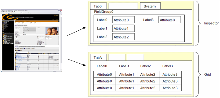
Within the Inspector, the attributes of an object can be structured and grouped to make the visual representation of an object more appealing and hopefully more user-friendly:
with Tabs you can divide up an object so that similar attributes are shown on a "page"; all uncustomized attributes are automatically shown under the Tab "Other Fields", system attributes are shown under the Tab "System"
you can add even more structure to a page, e.g. by collecting closely related attributes in a FieldGroup
within a FieldGroup then, you can apply ordering to the attributes by assigning individual attributes a Position and by setting ColumnBreaks
Tabs, FieldGroups and Attributes can all be named.
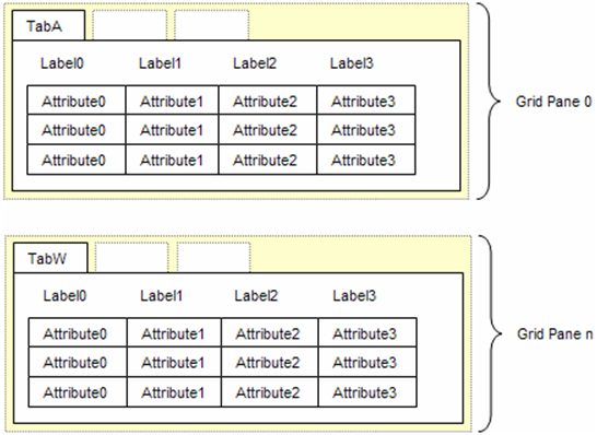
The Tabs in the Grid have a slightly different meaning than the Tabs in the Inspector, as each Tab in the Grid represents a reference defined in the UML model (remember that Tabs in the Inspector are defined by the customizer and mainly serve the purpose of structuring the attributes of an object). That is why you cannot "create" new Grid Tabs as a customizer. You can, however, change the order of these Tabs, you can (re)name them, or you can hide them. You can also display multiple Grids on the same page by allocating Tabs to different Panes.
Furthermore, you can select the attributes that are shown in the Grid and you can order them according to your liking. You can also define which of the attributes not visible in the Grid you want to appear in the search menu.
Chapter 4. A Sample UI Config File
In this chapter the following sample UI config file is discussed in detail:
Example 4-1. sample.xml
<?xml version="1.0" encoding="UTF-8"?>
<org.openmdx.base.Authority name="org:openmdx:ui1" xmlns:xsi="http://www.w3.org/2001/XMLSchema-instance" xsi:noNamespaceSchemaLocation="xri://+resource/org/openmdx/ui1/xmi1/ui1.xsd">
  <_object/>
  <_content>
    <provider>
      <org.openmdx.base.Provider qualifiedName="Trial" _operation="null">
        <_object/>
        <_content>
          <segment>
            <org.openmdx.ui1.Segment qualifiedName="Standard" _operation="null">
              <_object/>
              <_content>
                <elementDefinition>

<!--Segment Definition-->
                 <org.openmdx.ui1.ElementDefinition name="org:opencrx:kernel:segmentName:Segment">
                    <_object>
                      <active>true</active>
                      <changeable>false</changeable>
                      <toolTip>
                        <_item>ToolTip for Segment</_item>
                      </toolTip>
                      <label>
                        <_item>SegmentName</_item>
                      </label>
                      <order>
                        <_item>0</_item>
                        <_item>0</_item>
                        <_item>10</_item>
                      </order>
                      <iconKey>org:opencrx:kernel:segmentName:ClassName</iconKey>
                    </_object>
                    <_content/>
                  </org.openmdx.ui1.ElementDefinition>

<!--Grid Tab Definition-->
                 <org.openmdx.ui1.ElementDefinition name="org:opencrx:kernel:segmentName:ClassName:referenceName">
                    <_object>
                      <active>true</active>
                      <toolTip>
                        <_item>ToolTip for TabA</_item>
                      </toolTip>
                      <label>
                        <_item>TabA</_item>
                      </label>
                      <order>
                        <_item>0</_item>
                        <_item>0</_item>
                        <_item>10</_item>
                      </order>
                    </_object>
                    <_content/>
                  </org.openmdx.ui1.ElementDefinition>

<!--Inspector Definition-->
                 <org.openmdx.ui1.ElementDefinition name="org:opencrx:kernel:segmentName:ClassName">
                    <_object>
                      <active>true</active>
                      <toolTip>
                        <_item>ToolTip for Inspector</_item>
                      </toolTip>
                      <label>
                        <_item>InspectorTitle</_item>
                      </label>
                      <iconKey>org:opencrx:kernel:segmentName:ClassName</iconKey>
                    </_object>
                    <_content/>
                  </org.openmdx.ui1.ElementDefinition>

<!--Tab0 for Inspector-->
                 <org.openmdx.ui1.ElementDefinition name="org:opencrx:kernel:segmentName:ClassName:Pane:Attr:Tab:0">
                    <_object>
                      <active>true</active>
                      <toolTip>
                        <_item>ToolTip for Tab0</_item>
                      </toolTip>
                      <label>
                        <_item>Tab0</_item>
                      </label>
                    </_object>
                    <_content/>
                  </org.openmdx.ui1.ElementDefinition>

<!--FieldGroup0 in Tab0-->
                 <org.openmdx.ui1.ElementDefinition name="org:opencrx:kernel:segmentName:ClassName:Pane:Attr:Tab:0:Group:0">
                    <_object>
                      <active>true</active>
                      <toolTip>
                        <_item>ToolTip for FieldGroup0</_item>
                      </toolTip>
                      <label>
                        <_item>FieldGroup0</_item>
                      </label>
                    </_object>
                    <_content/>
                  </org.openmdx.ui1.ElementDefinition>

<!--Element Definitions FieldGroup0-->
                 <org.openmdx.ui1.ElementDefinition name="org:opencrx:kernel:segmentName:ClassName:Attribute0">
                    <_object>
                      <active>true</active>
                      <toolTip>
                        <_item>ToolTip for Attribute0</_item>
                      </toolTip>
                      <label>
                        <_item>Label0</_item>
                      </label>
                      <order>
                        <_item>0</_item>  <!-- tab   -->
                        <_item>0</_item>  <!-- group -->
                        <_item>10</_item> <!-- pos   -->
                      </order>
                    </_object>
                    <_content/>
                  </org.openmdx.ui1.ElementDefinition>

                  <org.openmdx.ui1.ElementDefinition name="org:opencrx:kernel:segmentName:ClassName:Attribute1">
                    <_object>
                      <active>true</active>
                      <toolTip>
                        <_item>ToolTip for Attribute1</_item>
                      </toolTip>
                      <label>
                        <_item>Label1</_item>
                      </label>
                      <order>
                        <_item>0</_item>  <!-- tab   -->
                        <_item>0</_item>  <!-- group -->
                        <_item>20</_item> <!-- pos   -->
                      </order>
                    </_object>
                    <_content/>
                  </org.openmdx.ui1.ElementDefinition>

                  <org.openmdx.ui1.ElementDefinition name="org:opencrx:kernel:segmentName:ClassName:Attribute2">
                    <_object>
                      <active>true</active>
                      <toolTip>
                        <_item>ToolTip for Attribute2</_item>
                      </toolTip>
                      <label>
                        <_item>Label2</_item>
                      </label>
                      <order>
                        <_item>0</_item>  <!-- tab   -->
                        <_item>0</_item>  <!-- group -->
                        <_item>30</_item> <!-- pos   -->
                      </order>
                    </_object>
                    <_content/>
                  </org.openmdx.ui1.ElementDefinition>

                  <org.openmdx.ui1.ElementDefinition name="org:opencrx:kernel:segmentName:ClassName:Attribute3">
                    <_object>
                      <columnBreak>true</columnBreak>
                      <active>true</active>
                      <toolTip>
                        <_item>ToolTip for Attribute3</_item>
                      </toolTip>
                      <label>
                        <_item>Label3</_item>
                      </label>
                      <order>
                        <_item>0</_item>  <!-- tab   -->
                        <_item>0</_item>  <!-- group -->
                        <_item>10</_item> <!-- pos   -->
                      </order>
                    </_object>
                    <_content/>
                  </org.openmdx.ui1.ElementDefinition>

                </elementDefinition>
              </_content>
            </org.openmdx.ui1.Segment>
          </segment>
        </_content>
      </org.openmdx.base.Provider>
    </provider>
  </_content>
</org.openmdx.base.Authority>
The above UI config file customizes an Inspector for the class ClassName and a Grid view for the same class:
Defining an Inspector
The following few lines of the UI config file define an Inspector for the class ClassName:
Example 4-2. Inspector Definition
.
<!--Inspector Definition-->
<org.openmdx.ui1.ElementDefinition name="org:opencrx:kernel:segmentName:ClassName">
  <_object>
    <active>true</active>
    <toolTip>
      <_item>ToolTip for Inspector</_item>
    </toolTip>
    <label>
      <_item>InspectorTitle</_item>
    </label>
    <iconKey>org:opencrx:kernel:segmentName:ClassName</iconKey>
  </_object>
  <_content/>
</org.openmdx.ui1.ElementDefinition>
.
The above code defines the following Inspector properties (and Figure 4-1 shows what the customized Inspector looks like):
the Inspector is active, i.e. visible
the toolTip of the Inspector
the label (i.e. name) of the Inspector
and the Inspector's icon
Defining an Inspector Tab
The following few lines of the UI config file define an Inspector Tab:
Example 4-3. Inspector Tab Definition
.
<!--Tab0 for Inspector-->
<org.openmdx.ui1.ElementDefinition name="org:opencrx:kernel:segmentName:ClassName:Pane:Attr:Tab:0">
  <_object>
    <active>true</active>
    <toolTip>
      <_item>ToolTip for Tab0</_item>
    </toolTip>
    <label>
      <_item>Tab0</_item>
    </label>
  </_object>
  <_content/>
</org.openmdx.ui1.ElementDefinition>
.
The above code defines the following Tab properties (and Figure 4-1 shows what the customized Inspector looks like):
the number 0 is assigned to the Tab (multiple Tabs are ordered by ascending numbers; this number is also important when assigning FieldGroups and attributes to a particular Tab)
the Tab is active, i.e. visible
the toolTip of the Tab
and the label (i.e. name) of the Tab
Defining a FieldGroup
The following few lines of the UI config file define a FieldGroup on Tab0 of the Inspector:
Example 4-4. FieldGroup Definition
.
<!--FieldGroup0 in Tab0-->
<org.openmdx.ui1.ElementDefinition name="org:opencrx:kernel:segmentName:ClassName:Pane:Attr:Tab:0:Group:0">
  <_object>
    <active>true</active>
    <toolTip>
      <_item>ToolTip for FieldGroup0</_item>
    </toolTip>
    <label>
      <_item>FieldGroup0</_item>
    </label>
  </_object>
  <_content/>
</org.openmdx.ui1.ElementDefinition>
.
The above code defines the following FieldGroup properties (and Figure 4-1 shows what the customized Inspector looks like):
the number 0 is assigned to the FieldGroup (multiple FieldGroups are ordered by ascending numbers; this number is also important when assigning attributes to a particular FieldGroup)
the FieldGroup is active, i.e. visible
the toolTip of the FieldGroup
and the label (i.e. name) of the FieldGroup
Positioning Fields
The following few lines of the UI config file position the field representing Attribute0 in FieldGroup0 on Tab0 of the Inspector:
Example 4-5. Field Positioning
.
<!--Element Definitions FieldGroup0-->
<org.openmdx.ui1.ElementDefinition name="org:opencrx:kernel:segmentName:ClassName:Attribute0">
  <_object>
    <active>true</active>
    <toolTip>
      <_item>ToolTip for Attribute0</_item>
    </toolTip>
    <label>
      <_item>Label0</_item>
    </label>
    <order>
      <_item>0</_item>  <!-- tab   -->
      <_item>0</_item>  <!-- group -->
      <_item>10</_item> <!-- pos   -->
    </order>
  </_object>
  <_content/>
</org.openmdx.ui1.ElementDefinition>
.
The above code defines the following Field properties (and Figure 4-1 shows what the customized Inspector looks like):
the field representing Attribute0 is positioned on Tab0 in FieldGroup0; it is furthermore assigned the position number 10 (multiple fields in the same FieldGroup are ordered by ascending position numbers)
the field is active, i.e. visible
the toolTip of the field
and the label (i.e. name) of the field
Similarly, the fields representing Attribute1 and Attribute2 are positioned in the same FieldGroup. The XML code for the field representing Attribute3 contains one additional line:
Example 4-6. Column Break
.
<org.openmdx.ui1.ElementDefinition name="org:opencrx:kernel:segmentName:ClassName:Attribute3">
  <_object>
    <columnBreak>true</columnBreak>
    <active>true</active>
.
The tab "<columnBreak>true</columnBreak>" causes a column Break before this particular field, which can be seen in Figure 4-1.
Hiding Fields
It is quite likely that the openCRX model contains attributes that are of no use to you. You can hide such attributes by changing the value of the <active>-tag from true to false. Please note that this change removes the particular attribute from the user interface only, i.e. there is no impact on the the openCRX model or the database.
The <changeable> Attribute
You can customize away those UI elements that enable users to easily create new objects or modify/remove existing objects of a particular class by setting the value of the <changeable>-tag to false. Please note that this change removes the respective menu entries (i.e. menu entry to create new objects and the operations Edit and Delete, see Figure 4-2) ) from the user interface only, i.e. customizing away these UI elements does not prevent skilled users from getting access to the respective functionality as it is still available on the server.
 To really prevent users from creating/modifying/deleting particular objects you need to set appropriate access levels - please refer to the openCRX Security Guide for details.
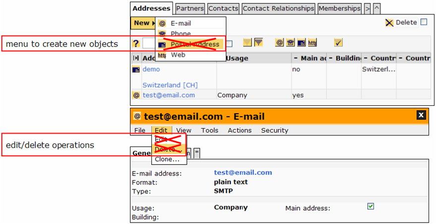
The following example shows how to customize away the creator menu for Postal Addresses (attached to Accounts) and the operations Edit and Delete on Postal Addresses (attached to Accounts).
Example 4-7. Example with changeable
  .
  <org.openmdx.ui1.ElementDefinition name="org:opencrx:kernel:account1:PostalAddress">
    <_object>
      <active>true</active>
      <changeable>false</changeable>
      <toolTip>
        <_item>Postal Address</_item>
      </toolTip>
      <label>
        <_item>Postal Address</_item>
      </label>
      <iconKey>PostalAddress</iconKey>
    </_object>
    <_content/>
  </org.openmdx.ui1.ElementDefinition>
  .
The above code removes the three UI elements crossed out in Figure 4-2.
The <filterable> Attribute
You can customize away those UI elements that enable users to filter objects by setting the value of the <filterable>-tag to false. Depending on the ElementDefinition at hand you either customize away the respective class filter button or the respective attribute filter buttons in the header of the grid table (see Figure 4-3).
The following example shows how to customize away the class filter button for Postal Addresses (attached to Accounts), i.e. the code removes the class filter button crossed out in Figure 4-3
Example 4-8. Example with filterable - Class Filter Button
  .
  <org.openmdx.ui1.ElementDefinition name="org:opencrx:kernel:account1:PostalAddress">
    <_object>
      <active>true</active>
      <filterable>false</filterable>
      <toolTip>
        <_item>Postal Address</_item>
      </toolTip>
      <label>
        <_item>Postal Address</_item>
      </label>
      <iconKey>PostalAddress</iconKey>
    </_object>
    <_content/>
  </org.openmdx.ui1.ElementDefinition>
  .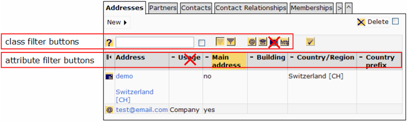
The following example shows how to customize away the Usage attribute filter buttons of Addressables, i.e. the code removes/disables the attribute filter buttons crossed out in Figure 4-3
Example 4-9. Example with filterable - Attribute Filter Buttons
  .
  <org.openmdx.ui1.ElementDefinition name="org:opencrx:kernel:address1:Addressable:usage">
    <_object>
      <active>true</active>
      <filterable>false</filterable>
      <toolTip>
        <_item>Usage of address</_item>
      </toolTip>
      <label>
        <_item>Usage</_item>
      </label>
      <orderFieldGroup>
        <_item>0</_item>
        <_item>10</_item>
        <_item>10</_item>
      </orderFieldGroup>
      <orderObjectContainer>
        <_item>0</_item>
        <_item>0</_item>
        <_item>4</_item>
      </orderObjectContainer>
    </_object>
    <_content/>
  </org.openmdx.ui1.ElementDefinition>
  .
The <sortable> Attribute
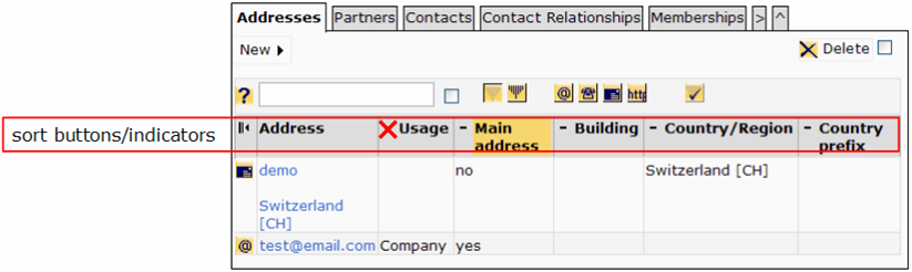
You can customize away those UI elements that enable users to sort objects by setting the value of the <sortable>-tag to false. This customizes away the respective sort buttons/indicators in the header of the grid table (see Figure 4-4).
The following example shows how to customize away the sort button/indicator for the Usage attribute of Addressables, i.e. the code removes the attribute sort button/indicator crossed out in Figure 4-4
Example 4-10. Example with sortable - Attribute Sort Buttons/Indicators
  .
  <org.openmdx.ui1.ElementDefinition name="org:opencrx:kernel:address1:Addressable:usage">
    <_object>
      <active>true</active>
      <sortable>false</sortable>
      <toolTip>
        <_item>Usage of address</_item>
      </toolTip>
      <label>
        <_item>Usage</_item>
      </label>
      <orderFieldGroup>
        <_item>0</_item>
        <_item>10</_item>
        <_item>10</_item>
      </orderFieldGroup>
      <orderObjectContainer>
        <_item>0</_item>
        <_item>0</_item>
        <_item>4</_item>
      </orderObjectContainer>
    </_object>
    <_content/>
  </org.openmdx.ui1.ElementDefinition>
  .
Defining a Grid
The following few lines of the UI config file define a Grid Tab:
Example 4-11. Grid Tab Definition
.
<!--Grid Tab Definition-->
<org.openmdx.ui1.ElementDefinition name="org:opencrx:kernel:segmentName:ClassName:referenceName">
  <_object>
    <active>true</active>
    <toolTip>
      <_item>ToolTip for TabA</_item>
    </toolTip>
    <label>
      <_item>TabA</_item>
    </label>
    <order>
      <_item>0</_item>
      <_item>0</_item>
      <_item>10</_item>
    </order>
  </_object>
  <_content/>
</org.openmdx.ui1.ElementDefinition>
.
The above code defines the following Grid Tab properties (and Figure 4-1 shows what the customized Grid looks like):
the order (0,0,10) is assigned to the Tab (the first of the three numbers is the pane number; for each unique pane number a complete grid is created and panes are displayed in increasing order - this feature allows you to display multiple grid tabs on the same page at the same time, i.e. without server roundtrips; multiple Tabs in the same pane are ordered by ascending order of the second and third number)
the Tab is active, i.e. visible
the toolTip of the Tab
and the label (i.e. name) of the Tab
Without additional customization the Grid usually displays the first few attributes of an object, whereas the attributes are ordered by ascending order numbers (tab, fieldgroup, pos). If there is need to change that ordering for the purpose of changing the order in the Grid you can change the element definition of the relevant attributes. The following example shows, how one would move Attribute3 to the first position in the Grid by replacing the tag <order> with the tags <orderFieldGroup> and <orderObjectContainer>:
Example 4-12. Field Ordering in the Grid
.
<org.openmdx.ui1.ElementDefinition name="org:opencrx:kernel:segmentName:ClassName:Attribute3">
  <_object>
    <active>true</active>
    <toolTip>
      <_item>ToolTip for Attribute0</_item>
    </toolTip>
    <label>
      <_item>Label0</_item>
    </label>
    <orderFieldGroup>
      <_item>0</_item>  <!-- tab   -->
      <_item>0</_item>  <!-- group -->
      <_item>10</_item> <!-- pos   -->
    </orderFieldGroup>
    <orderObjectContainer>
      <_item>0</_item> <!- pane                    -->
      <_item>0</_item> <!- gridOrderNumber1 -->
      <_item>1</_item> <!- gridOrderNumber2 -->
    </orderObjectContainer>
  </_object>
  <_content/>
</org.openmdx.ui1.ElementDefinition>
.
The Tabs in the Grid have a slightly different meaning than the Tabs in the Inspector, as each Tab in the Grid represents a reference defined in the UML model (remember that Tabs in the Inspector are defined by the customizer and mainly serve the purpose of structuring the attributes of an object). That is why you cannot "create" new Grid Tabs as a customizer. You can, however, change the order of these Tabs, you can (re)name them, or you can hide them.
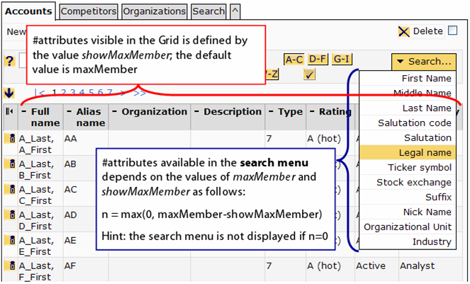
You can easily control the #attributes visible in the Grid and the #attributes available in the search menu by setting maxMember and showMaxMember to the desired values (see Figure 4-6 for details).
The following few lines of the UI config file account.xml define a Grid Tab Accounts as shown in the figure above:
Example 4-13. Grid Tab Definition with maxMember/showMaxMember
.
<!--Grid Tab Definition with maxMember/showMaxMember -->
<org.openmdx.ui1.ElementDefinition name="org:opencrx:kernel:account1:Segment:account">
  <_object>
    <active>true</active>
    <toolTip>
      <_item>all Accounts</_item>
    </toolTip>
    <label>
      <_item>Accounts</_item>
    </label>
    <order>
      <_item>0</_item>
      <_item>0</_item>
      <_item>10</_item>
    </order>
    <maxMember>20</maxMember>
    <showMaxMember>8</showMaxMember>
  </_object>
  <_content/>
</org.openmdx.ui1.ElementDefinition>
.
At the time of writing this guide the default value of maxMember is equal to 6 and the default value of showMaxMember is equal to the value of maxMember; furthermore, the upper limit for maxMember is set to 20.
The <inPlace> Attribute
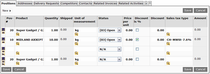
To facilitate quick entry of objects openCRX supports editable grids. You can designate a grid as editable by setting the value of the <inPlace>-tag to true. This brings up the respective edit button in the header of the grid table:.
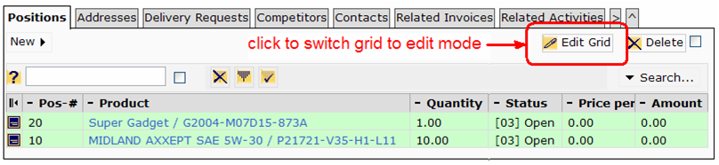
The following example shows the customization of the grid "Positions" of an opportunity:
Example 4-14. Example with inPlace - Editable Grid
  .
<org.openmdx.ui1.ElementDefinition name="org:opencrx:kernel:contract1:Opportunity:position">
  <_object>
    <active>true</active>
    <inPlace>true</inPlace>
    <toolTip>
      <_item>Opportunity Positions</_item>
    </toolTip>
    <label>
      <_item>Positions</_item>
    </label>
    <order>
      <_item>0</_item>
      <_item>0</_item>
      <_item>3</_item>
    </order>
    <maxMember>17</maxMember>
    <showMaxMember>11</showMaxMember>
  </_object>
  <_content/>
</org.openmdx.ui1.ElementDefinition>
.
The following figures shows the grid table "Positions" in edit mode:
Chapter 5. UI Configuration Overloading
It is likely that you want to change some of the default customizing. Quite possibly, however, (a) you want to make a few changes only and (b) you want to keep these changes if you upgrade to a new version of openCRX. This is where UI configuration overloading can add value. Instead of changing the original UI configuration files provided with the standard distribution you create a new configuration file (or multiple configuration files) containing all your changes. Make sure that you name your file(s) such that your changes are loaded AFTER the default configuration files (configuration files are loaded in alphabetical order), thereby overloading the original configuration.
For example, you might not need the invoicing features of openCRX because you have a full-blown ERP-system taking care of that. You could create an XML file hiding the tab [Invoices] of the Pipeline provider and save it to the ui configuration folder with a name like "zHideElements.xml":
Example 5-1. UI Configuration Overloading - Hiding Tab [Invoices] with zHideElements.xml
<?xml version="1.0" encoding="UTF-8"?>
<org.openmdx.base.Authority xmlns:xsi="http://www.w3.org/2001/XMLSchema-instance" name="org:openmdx:ui1" xsi:noNamespaceSchemaLocation="xri://+resource/org/openmdx/ui1/xmi1/ui1.xsd">
  <_object/>
  <_content>
    <provider>
      <org.openmdx.base.Provider qualifiedName="CRX" _operation="null">
        <_object/>
        <_content>
          <segment>
            <org.openmdx.ui1.Segment qualifiedName="Root" _operation="null">
              <_object/>
              <_content>
                <elementDefinition>
                  <org.openmdx.ui1.ElementDefinition name="org:opencrx:kernel:contract1:Segment:invoice">
                    <_object>
                    <active>false</active>
                      <toolTip>
                        <_item>Invoices</_item>
                      </toolTip>
                      <label>
                        <_item>Invoices</_item>
                      </label>
                      <order>
                        <_item>0</_item>
                        <_item>0</_item>
                        <_item>60</_item>
                      </order>
                    </_object>
                    <_content/>
                  </org.openmdx.ui1.ElementDefinition>
                </elementDefinition>
              </_content>
            </org.openmdx.ui1.Segment>
          </segment>
        </_content>
      </org.openmdx.base.Provider>
    </provider>
  </_content>
</org.openmdx.base.Authority>
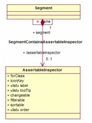
Chapter 6. The ui1 Model - Diagram Main
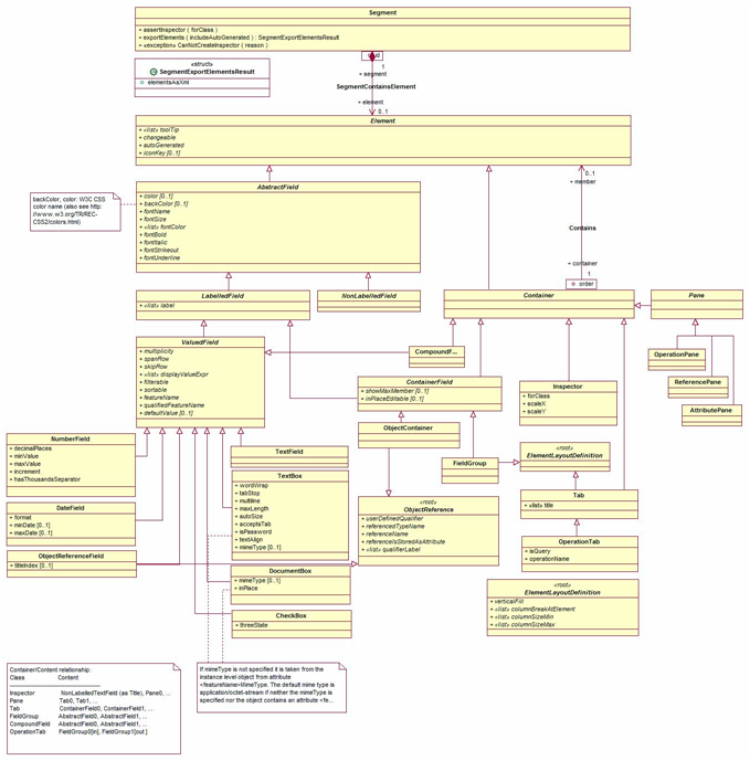
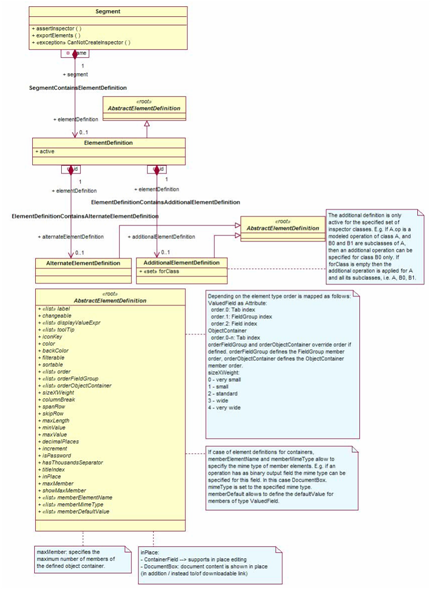
At the core of customizing openMDX-based applications is the ui1 model which formally describes the user interface. Should you look at this model you will realize that this guide barely scratched the surface of what is possible in terms of customizing the openCRX user interface. If you are keen to find out more you will find many examples of advanced customization features in the UI config files provided with the openCRX distribution.
Bibliography